Dear Friends
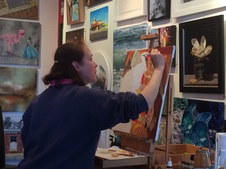
I'm thrilled to share some behind-the-scenes insights into my journey of creating this series of still life paintings. It's been an absolute joy diving into the research and sourcing the elements that bring each piece to life.
I'm thrilled to share some behind-the-scenes insights into my journey of creating this series of still life paintings. It's been an absolute joy diving into the research and sourcing the elements that bring each piece to life.
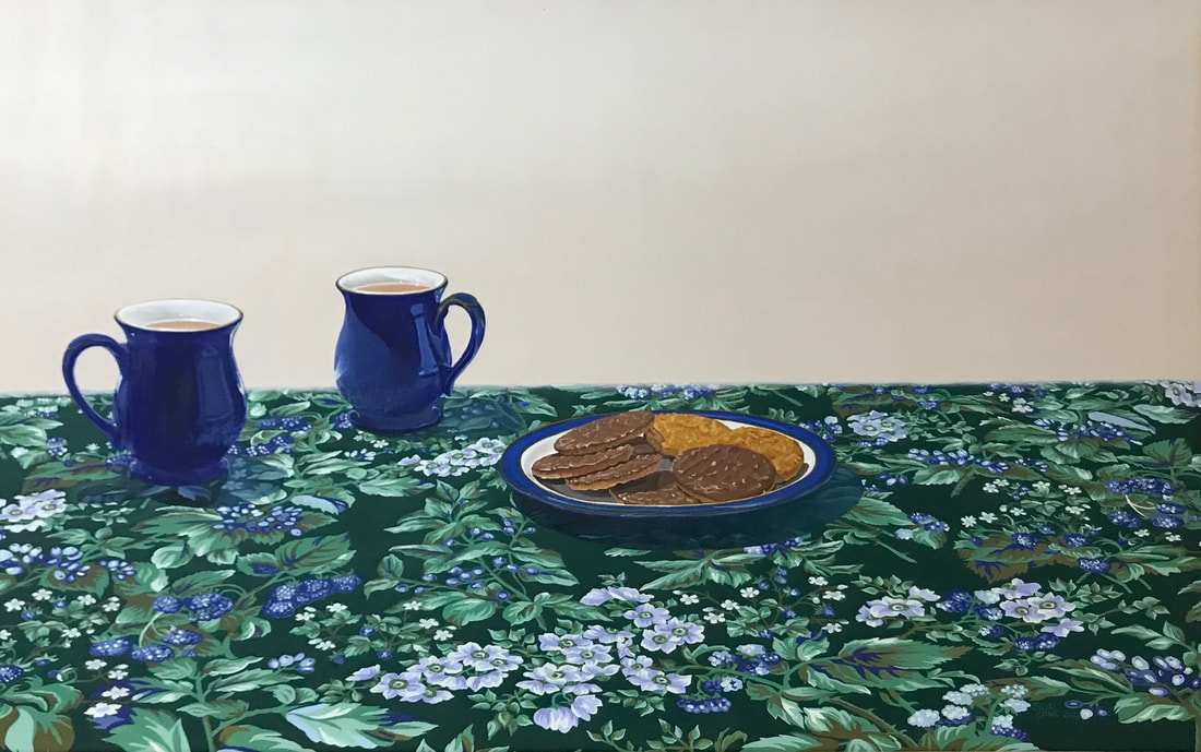
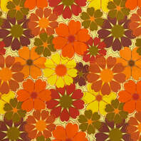 | Exploring the history and nuances of different biscuits, tablecloths, and crockery has been a fascinating adventure. As someone whose memories stretch back to the vibrant 1970s, I found myself drawn to the bright oranges and bold floral patterns that defined the era. Taking a creative leap, I found inspiration in vintage samples to tweak the patterns to improve the authenticity. |
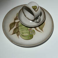
One highlight was rediscovering my Denby Potteries' Troubadour pattern crockery, a cherished inheritance from my grandmother. It's remarkable how these pieces evoke cherished beloved memories around the dinner table.
 |  |
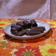 | Now, onto the biscuits—I couldn't resist including two of my childhood favorites, even if Cadbury Mini Rolls technically belong in the cake category! They were a staple in our afternoon tea selection, making them a fitting choice for the 1970s. |
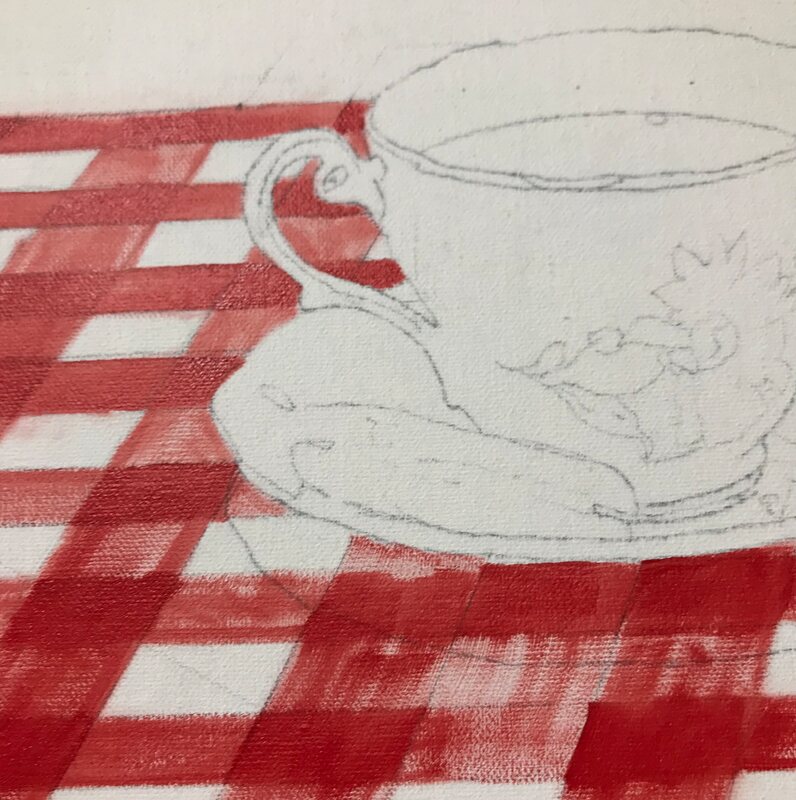
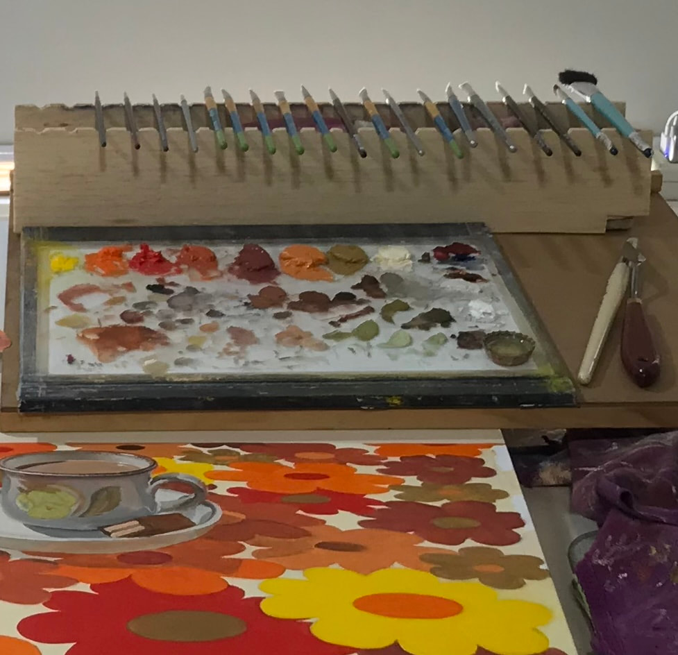 | Once all the elements were gathered, I experimented with various setups before diving into the initial layers of the painting. It's been an exhilarating process. |
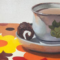 | I'm thrilled to share a sneak peek of the finished 1970s painting with you. |
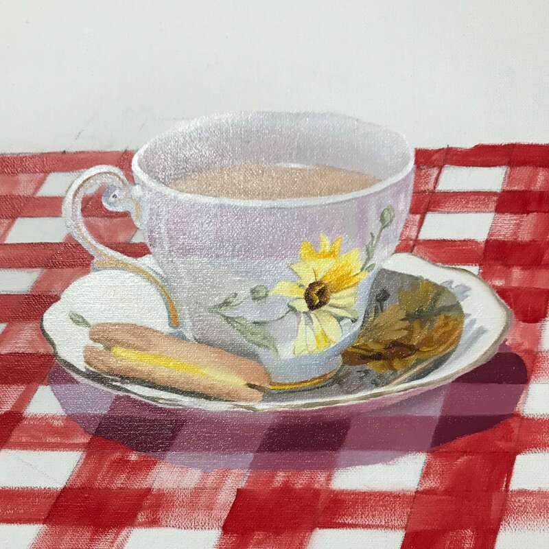
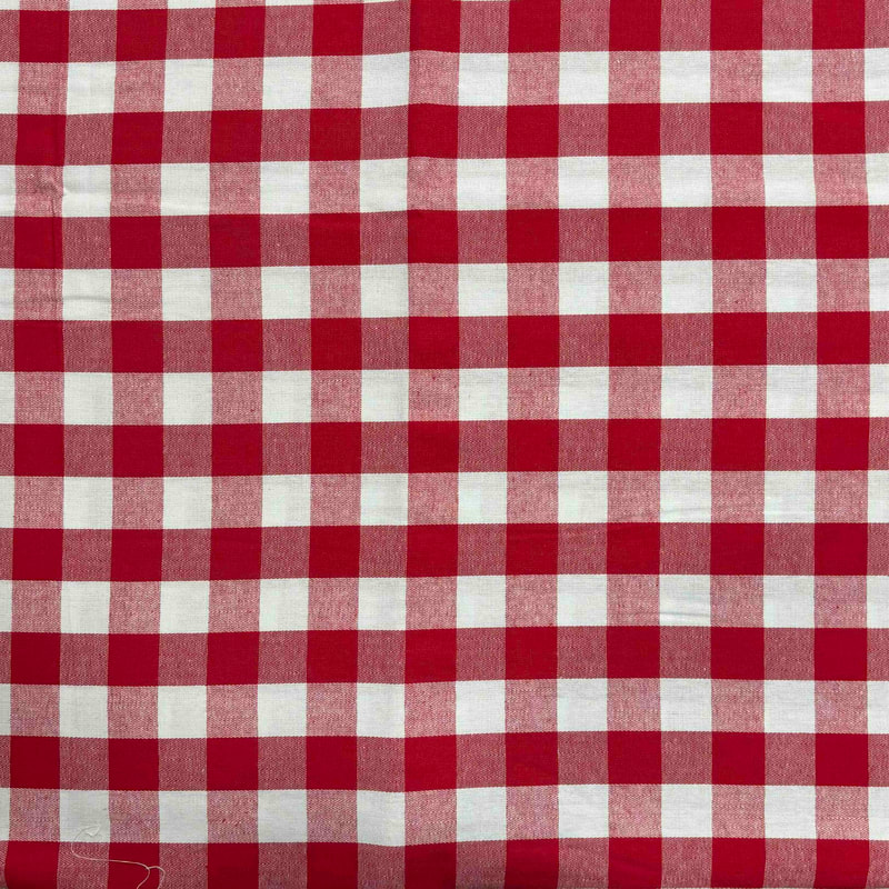 | For the 1950s, my research led me to the charming simplicity of gingham tablecloths. |
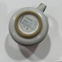
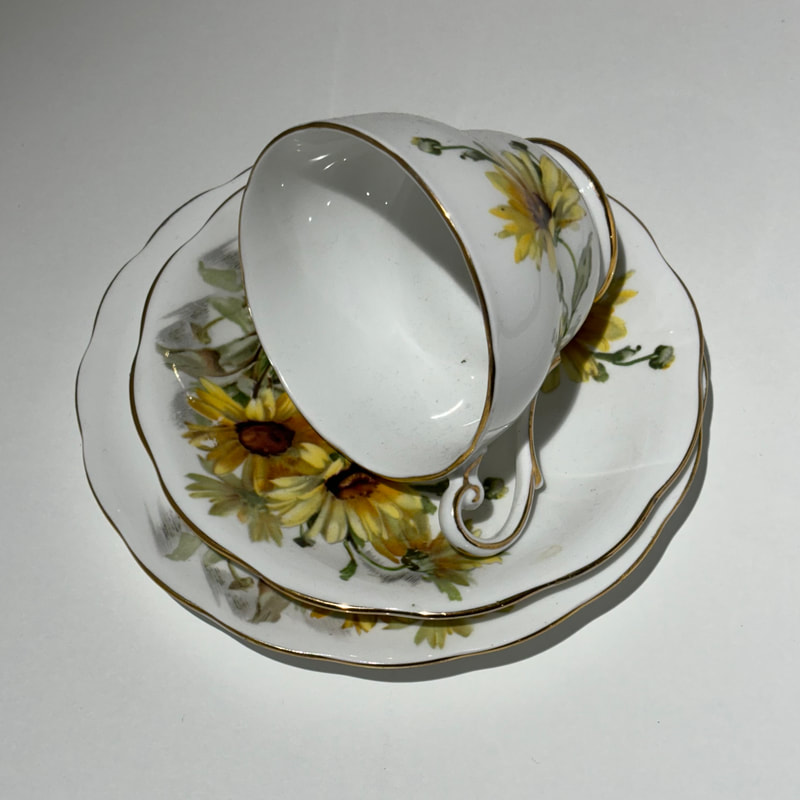 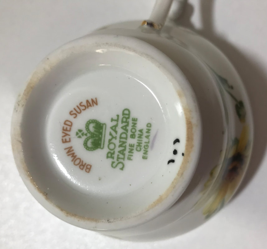 | I was entranced by the delicate floral patterns of Royal Standard's Brown Eyed Susan tea service. It's fascinating how each detail reflects the essence of the era. I found myself both intrigued and captivated by the markings left by pottery manufacturers on the base of their creations. |
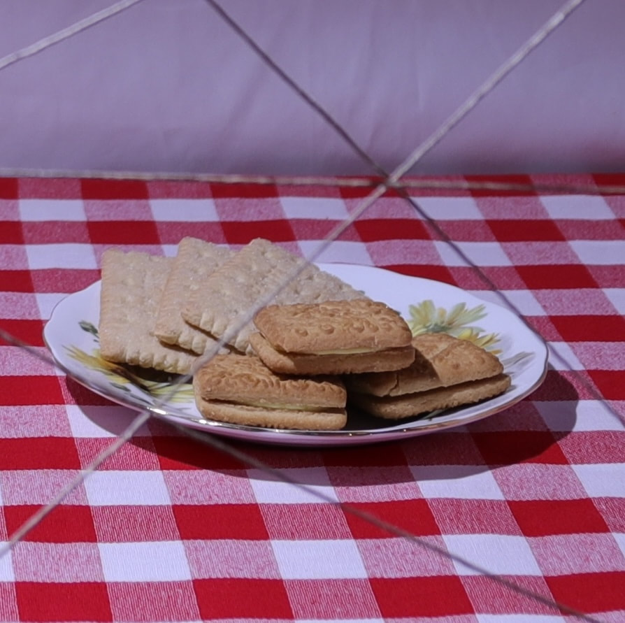 | Custard Cream and Nice biscuits, beloved staples of the 1950s, take centre stage in this painting. I've included a reference photo to give you a glimpse into my creative process. |
  | As I progress with each piece, I find myself particularly drawn to the 1950s—it holds a special place in my heart. From painting the intricate gingham pattern to capturing the essence of the crockery and biscuits, every brushstroke feels like a nostalgic journey. Thank you for joining me on this artistic adventure. I can't wait to share more updates with you soon! |
 RSS Feed